Don't Create Empty Links
The code to accompany this post is "Empty Links". Screen reader required!
Since 2019, empty links rank as one of the most common accessibility issues. According to the 2025 WebAIM Millions Project 45.4% of homepages contained empty links.
What is an empty link?
An empty link is a link with no accessible name (accName), meaning assistive technology (AT) users have no way to know what the link does. This often happens when visible link text is replaced with an icon or image - e.g. a shopping cart icon replaces “View cart”, or a social media logo replaces the text of a company name - without providing a text alternative for AT.
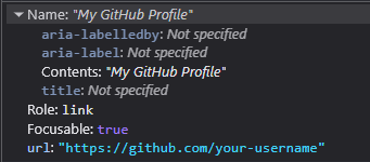
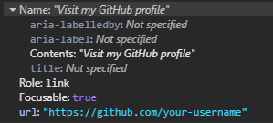
A standard text-based link example
A typical text-based link exposes that text as its accName. Additionally, links are styled by default - typically underlined and coloured - to make it visually clear that it's a link.
A('My GitHub Profile', href='https://github.com/your-username')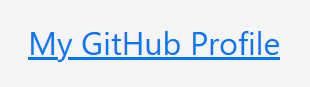
And this can be seen in the "Accessibility" panel in browser DevTools.
Writing accessible link text
Only using text for links does not automatically make them accessible. The text should be clear and descriptive for everyone and, where possible, make sense when read or heard out of context. In general:
- Don't be vague: avoid “Click here”, “Read more”, or “Download” that give no context when read out of place.
- Be specific: “Read more about Physical Reservoir Computing” is better than “Read more”.
- Keep it simple: avoid unnecessary jargon or complex wording.
- Avoid redundant phrasing like “Click here to” or “link to”. For example, instead of “Click here to download”, use “Download the 2025 Budget Breakdown (PDF)”.
Clear, descriptive link text improves both accessibility and usability.
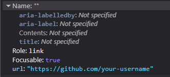
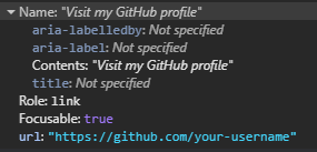
An empty link example
The text has been replaced with image to display a Github logo.
A(Img(src='images/logos/github.svg'), href='https://github.com/your-username')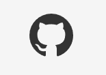
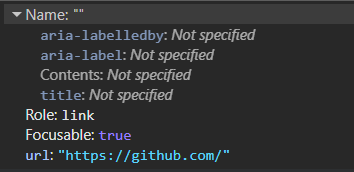
A sighted user may recognise the image and understand the purpose of the link but as the screenshot below shows, nothing meaningful is exposed to AT apart from its role. As it's a native HTML element the role is provided automatically.
How they appear to a screen reader user
The differences between a standard text link and an empty link becomes clearer when announced by screen readers.
Firefox and NVDA
The text link is announced as “My GitHub Profile link” which is clear and meaningful.
The empty link is announced as “your username graphic link” NVDA is using the URL path as the name, which gives no indication of purpose. In many real cases, that path could be long and/or unreadable - UUIDS, query strings etc. - making the user experience even worse.
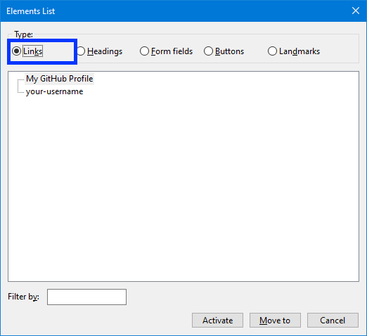
Here is how the links appear in NVDA's "Elements" list via the keyboard command Insert + F7:
Edge and Windows Narrator
Note: Microsoft Edge is built on Chromium (like Google Chrome), so this example also illustrates how other Chromium-based browsers typically handle empty links with screen readers.
The text link is announced simply as “Link, My GitHub Profile” which is clear and understandable.
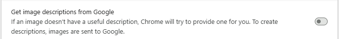
The empty link is announced as “Link, to get missing image descriptions open the context menu” and then Narrator continues by reading out the entire URL. This gives the user no meaningful indication of the link's purpose and adds unnecessary noise.
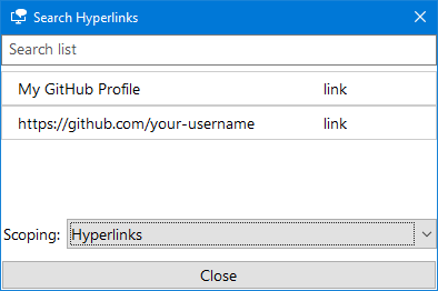
And in Narrator's "Elements" List via Insert + F7:
Browser attempts to "fix" missing content
As shown in the Edge and Narrator example above, certain browsers can identify an issue and attempt to resolve it. Both Edge and Chrome offer the option to search via Google or Bing to find information about the image being used for the link. In practice, this behaviour is unreliable (failing more than it succeeds in my experience) and happens even when the related accessibility settings have been turned off in both browsers

Fix empty links by providing an accessible name
As mentioned at the start, an empty link does not provide an accName for the accessibility tree which in turns means there is nothing useful available to the AT. The Accessible Name and Description Algorithm is used determine what the accName of an element should be. The list of properties used by the algorithm is visible in most browser's DevTools in the "Accessibility" panel in the "Name" section.
In the spirit of the first rule of ARIA - use native HTML and attributes before turning to ARIA - these solutions will follow a similar approach.
The guidelines given at the start about writing accessible link text, in general, apply for the fixes that will be discussed below.
Before we look at the different ways to fix empty links, here's what a properly accessible link sounds like with a screen reader.
An accessible link with Firefox and NVDA
An accessible link Narrator and Edge
Note: Microsoft Edge is a Chromium-based browser (like Google Chrome), so this example also reflects how properly named links can work in other Chromium browsers.
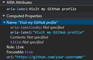
Option 1 Use the <img> alt text attribute
Technically, the alt text is intended as an alternate text description of an image for the accessibility tree. However, when an image replaces link text it is considered a functional image and the alt attribute can be used to tell an AT user what the link will do instead of describing the image.
A(
  Img(
      src='images/bootstrap/github.svg',
      alt='Visit my GitHub profile'
    ),
    href='https://github.com/your-username'
)
The alt attribute provides the accName for the empty link:
alt text tips for functional images
Tell the user where they'll go or what will happen not how to interact or what the element is.
- Describe the purpose of the link.
- Be brief and unique, avoid generic phrases like 'Read More' or 'Download Here'.
- Don't use actions like 'click', 'tap' or 'press'.
- Don't reference the elements like 'link' or 'image'.
Option 2 - Use 'visually hidden' text
Also known as 'sr-only' or 'screen reader only' in other CSS libraries like older versions of Bootstrap and the current version of Tailwind it is a way to hide text while still making it accessible to AT.
As mentioned in the "Intro to the Accessibility Tree" post, elements that are hidden from the DOM do not become part of the accessibility tree. In this case, the content is made invisible to sighted users while keeping it in the DOM and therefore available to the accessibility tree.
For a thoroughly detailed breakdown of the technique please read Scott O'Hara's "Inclusively Hidden" post. It can be used to hide a lot of other content in an accessible way.
.visually-hidden {
    clip: rect(0 0 0 0);
    clip-path: inset(50%);
    height: 1px;
    overflow: hidden;
    position: absolute;
    white-space: nowrap;
    width: 1px;
}
To prevent screen readers from a "double announcement" of both i.e. the alt text AND the visually hidden text, set alt to an empty string.
A(
    Img(src='images/bootstrap/github.svg', alt=''),
    Span('Vist my GitHub profile', cls='visually-hidden'),
    href='https://github.com/your-username'
)
The accName is now provided by the text content of the Span().
This approach works well across AT and browsers and is easy to localise if needed.
Option 3 - Use aria-label on the link
aria-label adds a programmatic label (i.e. it exists in code but not visually) to elements and works well for short amounts of text.
A(
    Img(src='images/bootstrap/github.svg', alt=''),
    href='https://github.com/your-username',
    aria_label='Visit My GitHub profile'
)
The accName will come now from the aria-label text. Some screen readers will announce the <a> as a "link" when announcing the text therefore to avoid confusing repetition - e.g. "Link go to github.com link" or "Go to github.com link link" - don't include "Link" in the aria-label text.
Note: There are known issues with the translation of text in aria-label. For a detailed explanation see Adrian Roselli's "aria-label Does Not Translate".
When using inline <svg> images
There are many benefits to using inline <svg> such as they are exposed to CSS styling (e.g. theme based colour changes using 'currentColor') and JavaScript interaction (e.g. animation). The overall result is the same as using <img> but there are more steps in the process of making them accessible.
Option 1 - Use 'visually hidden' text
- Add the
<span>with the text you want to visually hide. - Add
role="img"to the<svg>to ensure AT treats it as one image and not as a group of graphic elements. - Add
aria-hidden="true"to hide the<svg>from screen readers to prevent any potential double announcements. - Add
focusable="false"to prevent issues with some versions of browsers where users could confusingly TAB to the SVG itself.
A(
  Svg(
      Path(d='M8 0C3.58 0 0 3.58 0 8c0 3.54 2.29 6.53 5.47 7.59.4.07.55-.17.55-.38 0-.19-.01-.82-.01-1.49-2.01.37-2.53-.49-2.69-.94-.09-.23-.48-.94-.82-1.13-.28-.15-.68-.52-.01-.53.63-.01 1.08.58 1.23.82.72 1.21 1.87.87 2.33.66.07-.52.28-.87.51-1.07-1.78-.2-3.64-.89-3.64-3.95 0-.87.31-1.59.82-2.15-.08-.2-.36-1.02.08-2.12 0 0 .67-.21 2.2.82.64-.18 1.32-.27 2-.27s1.36.09 2 .27c1.53-1.04 2.2-.82 2.2-.82.44 1.1.16 1.92.08 2.12.51.56.82 1.27.82 2.15 0 3.07-1.87 3.75-3.65 3.95.29.25.54.73.54 1.48 0 1.07-.01 1.93-.01 2.2 0 .21.15.46.55.38A8.01 8.01 0 0 0 16 8c0-4.42-3.58-8-8-8'),
      xmlns='http://www.w3.org/2000/svg',
      width='16',
      height='16',
      fill='currentColor',
      viewbox='0 0 16 16',
      cls='bi bi-github',
      role='img',
      aria_hidden='true',
      focusable='false'
    ),
    Span('Visit my GitHub profile', cls='visually-hidden'),
  href='https://github.com/your-username'
)
Option 2 - Use aria-label
- Add an
aria-labelto the<a>with the text you to expose to AT. - Add
role="img"to the<svg>to ensure AT treats it as one image and not as a group of graphic elements. - Add
aria-hidden="true"to the<svg>to hide it from screen readers and prevent any potential double announcements. - Add
focusable="false"to prevent issues with some versions of browsers where users could confusingly TAB to the SVG itself.
A(
Svg(
Path(d='M8 0C3.58 0 0 3.58 0 8c0 3.54 2.29 6.53 5.47 7.59.4.07.55-.17.55-.38 0-.19-.01-.82-.01-1.49-2.01.37-2.53-.49-2.69-.94-.09-.23-.48-.94-.82-1.13-.28-.15-.68-.52-.01-.53.63-.01 1.08.58 1.23.82.72 1.21 1.87.87 2.33.66.07-.52.28-.87.51-1.07-1.78-.2-3.64-.89-3.64-3.95 0-.87.31-1.59.82-2.15-.08-.2-.36-1.02.08-2.12 0 0 .67-.21 2.2.82.64-.18 1.32-.27 2-.27s1.36.09 2 .27c1.53-1.04 2.2-.82 2.2-.82.44 1.1.16 1.92.08 2.12.51.56.82 1.27.82 2.15 0 3.07-1.87 3.75-3.65 3.95.29.25.54.73.54 1.48 0 1.07-.01 1.93-.01 2.2 0 .21.15.46.55.38A8.01 8.01 0 0 0 16 8c0-4.42-3.58-8-8-8'),
xmlns='http://www.w3.org/2000/svg',
width='16',
height='16',
fill='currentColor',
viewbox='0 0 16 16',
cls='bi bi-github',
role='img',
aria_hidden='true'
),
href='https://github.com/your-username',
aria_label='Visit My GitHub profile'
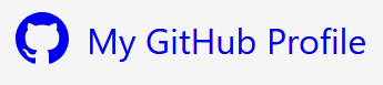
)A More Inclusive Option - Image and Text
While there are legitimate design reasons for not including both, a more inclusive approach is to pair the image or icon with visible link text. The link's accName will come from the text (as seen in the very first example), and the image can be hidden from ATs. This avoids relying on hidden labels and improves clarity for all users.
Note: Additional CSS is often needed to align icons and text, especially for spacing and vertical alignment. Styling details will vary depending on your chosen images and CSS framework.
For <img>
- Set the
alt=''as the icon is now considered "decorative" i.e. providing no useful information requiring an alternate description. - Add
aria-hidden='true'to make sure it is ignored by screen readers.
A(
    Img(src='images/bootstrap/github.svg', alt='', aria_hidden='true'),
    'My GitHub profile'
    href='https://github.com/your-username'
)
For inline <svg>
- Add
aria-hidden='true'to hide the SVG from screen readers. - Add
focusable='false'to prevent the user from TAB-ing to the SVG itself.
A(
  Svg(
      Path(d='M8 0C3.58 0 0 3.58 0 8c0 3.54 2.29 6.53 5.47 7.59.4.07.55-.17.55-.38 0-.19-.01-.82-.01-1.49-2.01.37-2.53-.49-2.69-.94-.09-.23-.48-.94-.82-1.13-.28-.15-.68-.52-.01-.53.63-.01 1.08.58 1.23.82.72 1.21 1.87.87 2.33.66.07-.52.28-.87.51-1.07-1.78-.2-3.64-.89-3.64-3.95 0-.87.31-1.59.82-2.15-.08-.2-.36-1.02.08-2.12 0 0 .67-.21 2.2.82.64-.18 1.32-.27 2-.27s1.36.09 2 .27c1.53-1.04 2.2-.82 2.2-.82.44 1.1.16 1.92.08 2.12.51.56.82 1.27.82 2.15 0 3.07-1.87 3.75-3.65 3.95.29.25.54.73.54 1.48 0 1.07-.01 1.93-.01 2.2 0 .21.15.46.55.38A8.01 8.01 0 0 0 16 8c0-4.42-3.58-8-8-8'),
      xmlns='http://www.w3.org/2000/svg',
      width='16',
      height='16',
      fill='currentColor',
      viewbox='0 0 16 16',
      cls='bi bi-github',
      role='img',
      aria_hidden='true'
    ),
  'My GitHub profile',
  href='https://github.com/your-username'
)
Check the framework or library provider's advice
As more frameworks and libraries become serious about their accessiblity many of them will offer guidance on the best ways to use their icons. For example, and to their credit, sites like Bootstrap Icons provide accessibility advice. As with everything, it is important to perform your own testing and verify things work as desired.
WCAG Success Criteria
These WCAG success criteria relate to the accessibility topics covered in this post.
1.1.1 Non-text Content (Level A) - Any content that isn't text, such as images, icons, or buttons, must have a text alternative so assistive technologies can understand its purpose.
2.4.4 Link Purpose (In Context) (Level A) - Users should be able to understand what a link does from its text and surrounding context.
2.4.9 Link Purpose (Link Only) (Level AAA) - Users should be able to understand what a link does from the link's text alone.
4.1.2 Name, Role, Value (Level A) - Every interactive element must have a name and role that assistive technologies can detect via the accessibility tree.