Don't Create Empty Buttons
The code to accompany this post is "Empty Buttons". Screen reader required!.
Like empty links, empty buttons lack an "accessible name" (accName). They are commonly the result of using images or icons - often referred to as "icon buttons" - to communicate the button's purpose to sighted users without providing an alternative for assitive technology (AT) users. If the user does not know what a button does, they are unlikely to want to interact with it.
According to the Web AIM Millions project, empty buttons have been in the Top 6 accessibility issues since 2019, with 29.6% of homepages having at least one empty button in 2025.
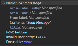
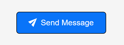
A standard button with text example
A standard button with visible text uses that text as its accName.
Button('Send Message')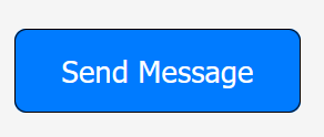
This is exposed in the browser's accessibility tree. It is clear to both sighted users and AT users what the result of interacting with the button will be.
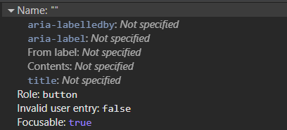
An empty button example
This button uses an image to convey its purpose.
Button(Img(src='/bootstrap/icons/send.svg'))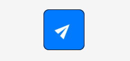
But no accName is exposed in the accessibility tree. A role is available because <button> is a native HTML element and that accessible information is provided automatically.
How they appear to a screen reader user
The differences between the buttons becomes clearer when announced by screen readers.
Firefox and NVDA
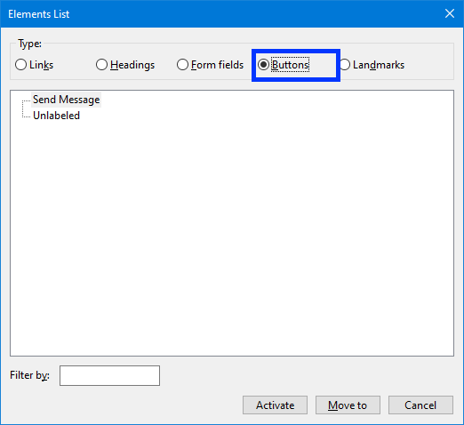
NVDA announces the text button using its accName, "Send Message button", while the empty button is announced simply as "button".
Here is how the buttons present themselves in NVDA's Elements list via NVDA Key + F7, Alt + B:
Edge and Narrator
Windows Narrator is the same, the first button is announced as "Send Message button" while the second one is only "button".
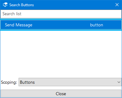
And only the labelled button appears in Narrator's Element list via Insert + F7:
How to fix empty buttons by providing an accessible name
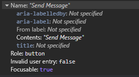
The Accessible Name and Description Algorithm is used to determine an element's accName. The list of properties used by the algorithm is visible in most browser's DevTools in the "Accessibility" panel in the "Name" section.
In the spirit of the first rule of ARIA - use native HTML and attributes before turning to ARIA - these solutions will follow a similar approach.
An accessible button with NVDA
An accessible button with Narrator
Option 1 - Use the <img> alt text attribute
Technically, the alt text is intended as an alternate text description of an image for the accessibility tree. With icon buttons the alt attribute is an acceptable way to provide an accName that tells an AT user what the purpose of the button is.
Button(Img(src='/bootstrap/icons/send.svg', alt='Send Message'))The button now has an accName that will be in the accessibility tree, and is viewable in browser DevTools.
alt text tips
Buttons should be used for triggering actions, tell the user what will happen if they activate the button.
- Use short, functional terms e.g. "Delete", "Edit", or "Send Message".
- Don't mention actions like "click", "tap" or "press".
- Don't include the element e.g. "Delete" not "Delete Button"
Option 2 - Use 'visually hidden' text
Also known as 'sr-only' or 'screen reader only' in other CSS libraries like older versions of Bootstrap and the current version of Tailwind it is a way to hide text while still making it accessible to AT.
As mentioned in the "Intro to the Accessibility Tree" post, elements that are hidden from the DOM do not become part of the accessibility tree. In this case, the content is made invisible to sighted users while keeping it in the DOM and therefore available to the accessibility tree.
For a thoroughly detailed breakdown of the technique please read Scott O'Hara's "Inclusively Hidden" post. It can be used to hide a lot of other content, not just button related text, in an accessible way.
.visually-hidden {
    clip: rect(0 0 0 0);
    clip-path: inset(50%);
    height: 1px;
    overflow: hidden;
    position: absolute;
    white-space: nowrap;
    width: 1px;
}
To prevent screen readers from a "double announcement" of both the alt text and the visually hidden text, set alt to an empty string.
Button(
    Img(
      src='/bootstrap/icons/send.svg',
      alt=''
    ),
    Span(
        'Send Message',
        cls='visually-hidden'
      )
    )
And now button's accName will be derived from it's "Contents" as shown in the screenshot below.
Option 3 - Use aria-label on the <button>
aria-label adds a programmatic label (it exists in code but not visually) to the button.
Button(
Img(
src='/bootstrap/icons/send.svg',
alt=''
),
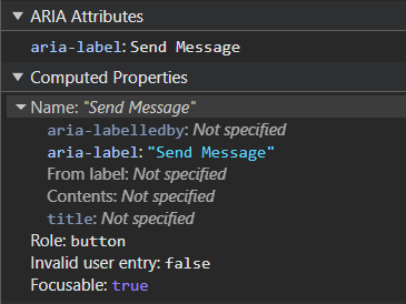
aria_label='Send Message'
)The accName will come now from the aria-label text. The tips mentioned above for writing alt text also apply for aria-labels in this instance.
Note: There are known issues with the translation of text in aria-label. For a detailed explanation see Adrian Roselli's "aria-label Does Not Translate".
When using inline <svg>
There are many benefits to using inline <svg> such they are exposed to CSS styling (e.g. theme based colour changes using 'currentColor') and JavaScript interaction (e.g. animation). There are some additional steps required when using them with buttons.
Option 1 - Use 'visually hidden' text
- Add the
<span>with the text you want to visually hide. - Add
role="img"to the<svg>to ensure AT treats it as one image and not as a group of graphic elements. - Add
aria-hidden="true"to hide the<svg>from screen readers to prevent any potential double announcements. - Add
focusable="false"to prevent issues with some versions of browsers where users could confusingly TAB to the SVG itself inside the button.
Button(
    Span('Send Message', cls='visually-hidden'),
    Svg(
        Path(d='M15.854.146a.5.5 0 0 1 .11.54l-5.819 14.547a.75.75 0 0 1-1.329.124l-3.178-4.995L.643 7.184a.75.75 0 0 1 .124-1.33L15.314.037a.5.5 0 0 1 .54.11ZM6.636 10.07l2.761 4.338L14.13 2.576zm6.787-8.201L1.591 6.602l4.339 2.76z'),
        xmlns='http://www.w3.org/2000/svg',
        width='16',
        height='16',
        fill='currentColor',
        viewbox='0 0 16 16',
        cls='bi bi-send',
        role='img',
        aria_hidden='true',
        focusable='false'
    )
)
Option 2 - Use aria-label
- Add an
aria-labelto the<button>with the text you to use for the accName. - Add
role="img"to the<svg>to ensure AT treats it as one image and not as a group of graphic elements. - Add
aria-hidden="true"to the<svg>to hide it from screen readers and prevent any potential double announcements. - Add
focusable="false"to prevent issues with some versions of browsers where users could confusingly TAB to the SVG itself inside the button.
Button(
    Svg(
        Path(d='M15.854.146a.5.5 0 0 1 .11.54l-5.819 14.547a.75.75 0 0 1-1.329.124l-3.178-4.995L.643 7.184a.75.75 0 0 1 .124-1.33L15.314.037a.5.5 0 0 1 .54.11ZM6.636 10.07l2.761 4.338L14.13 2.576zm6.787-8.201L1.591 6.602l4.339 2.76z'),
        xmlns='http://www.w3.org/2000/svg',
        width='16',
        height='16',
        fill='currentColor',
        viewbox='0 0 16 16',
        cls='bi bi-send',
        role='img',
        aria_hidden='true',
        focusable='false'
    ),
    aria_label='Send Message'
)
A More Inclusive Option - Image and Text
A more robust and overall inclusive approach would be to include both the image and the text in the button. As shown in the very first example, the button's accName will be derived from the text and the icon will be hidden from AT. However, there are valid reasons for not doing this such as a preferred design aesthetic or simply a lack of screen space.
Note: Additional CSS is often needed to align icons and text, especially for spacing and vertical alignment. Styling details will vary depending on your chosen images and CSS framework.
For <img>
- Set the
alt=''as the icon is now considered "decorative" i.e. providing no useful information requiring an alternate description. - Add
aria-hidden='true'to make sure it is ignored by screen readers.
Button(
    Img(
      src='/bootstrap/icons/send.svg',
      alt='',
      aria_hidden='true'
    ),
    'Send Message',
  )
For inline <svg>
- Add
aria-hidden='true'to hide the SVG from screen readers. - Add
focusable='false'to prevent the user from TAB-ing to the SVG itself.
Button(
    Svg(
        Path(d='M15.854.146a.5.5 0 0 1 .11.54l-5.819 14.547a.75.75 0 0 1-1.329.124l-3.178-4.995L.643 7.184a.75.75 0 0 1 .124-1.33L15.314.037a.5.5 0 0 1 .54.11ZM6.636 10.07l2.761 4.338L14.13 2.576zm6.787-8.201L1.591 6.602l4.339 2.76z'),
        xmlns='http://www.w3.org/2000/svg',
        width='16',
        height='16',
        fill='currentColor',
        viewbox='0 0 16 16',
        cls='bi bi-send',
        aria_hidden='true',
        focusable='false'
    ),
    'Send Message'
)
WCAG Success Criteria
These WCAG success criteria relate to the accessibility topics covered in this post.
1.1.1 Non-text Content (Level A) - Any content that isn't text, such as images, icons, or buttons, must have a text alternative so assistive technologies can understand its purpose.
4.1.2 Name, Role, Value (Level A) - Every interactive element must have a name and role that assistive technologies can detect via the accessibility tree.